

The Perry
Luxury real estate branding
Overview
Background
The Perry is a planned upscale apartment development located within the Park Potomac community in Potomac, MD. Its prime, DC-area location is just steps away from unique shops and award-winning dining options.
The buildings feature standout architecture; thoughtfully selected décor like hand-chosen fixtures, soothing colors, and a blend of comforting textures; and superior amenities such as a pool area with outdoor kitchen, clubroom, outdoor meditation garden, fitness center, concierge, and business center.
Target Audience
Mature singles, some couples without children. Divorced men; career women. Empty-nesters looking for easy, apartment living and a fresh transition to something new, exciting, and flattering to the ego. For some, this will be a second or even third residence. Age 35-54.
Tone
Posh but not pretentious. Informal yet sophisticated. Creative cool meets modern luxury.
Concept Rationale
The overall aesthetic is inspired by the interior design of the building — an eclectic mix of premium stylish finishes and mid-century modern design cues. Colors and textures found throughout the interior spaces weave their way into this branding.
The name of the property is an allusion to Thomas Perry, an early inhabitant of Potomac, MD, who built the Perry Store in 1881. A signature is implied by the hand-lettering of the logo, which is intended to anthropomorphize the property by imbuing a warm sense of personality and character.
Designed while working at HZDG.
Sketches
Thumbnail sketches.
Development of hand-lettering.
Development of hand-lettering.
Logo system
Main logo.
Secondary badge mark.
Main logo, letterpressed.
Secondary badge mark, letterpressed.
Tagline and patterns
Logo with tagline lockup and patterns.
Secondary badge mark and patterns.
Examples of branding usage
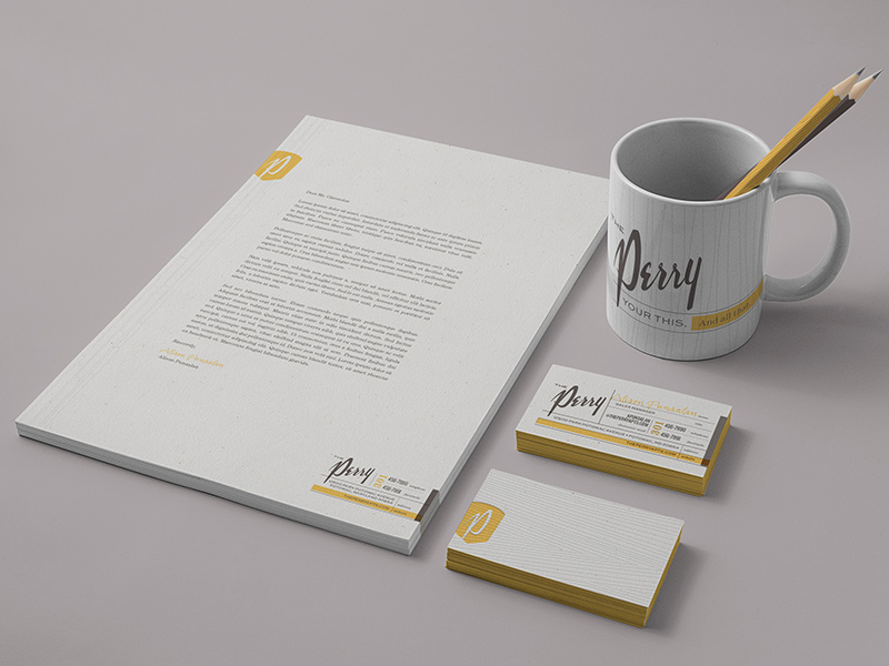
Stationery system.
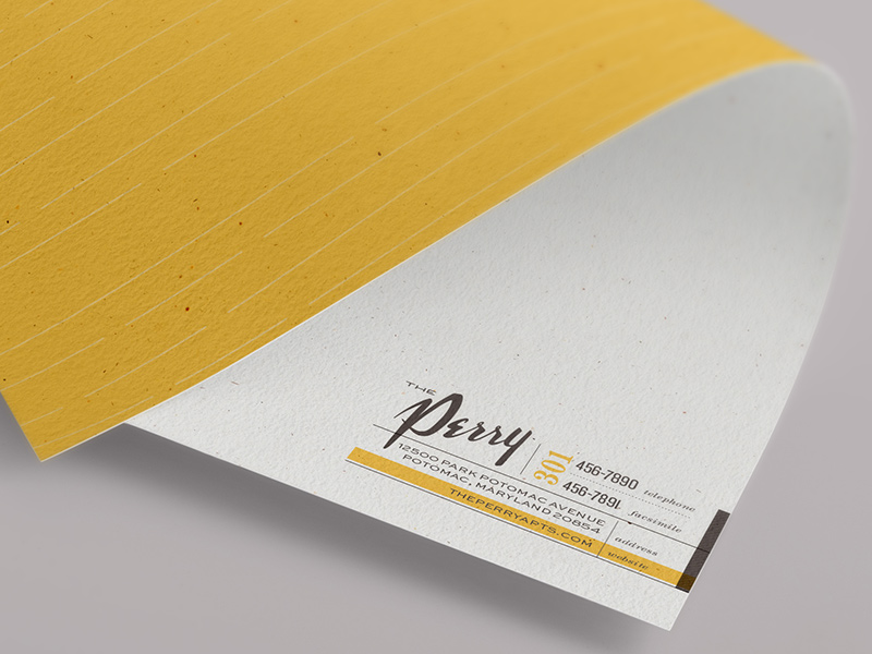
Letterhead detail.
Letterhead detail.
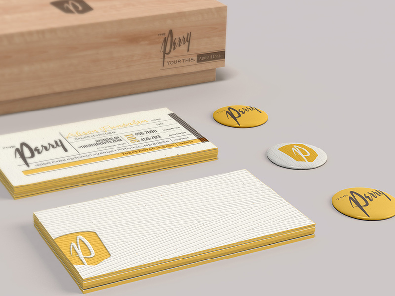
Business cards.
Business cards.
Stationery system.
Stationery system detail.
Stationery system detail.
Business cards detail.
Carrier detail.
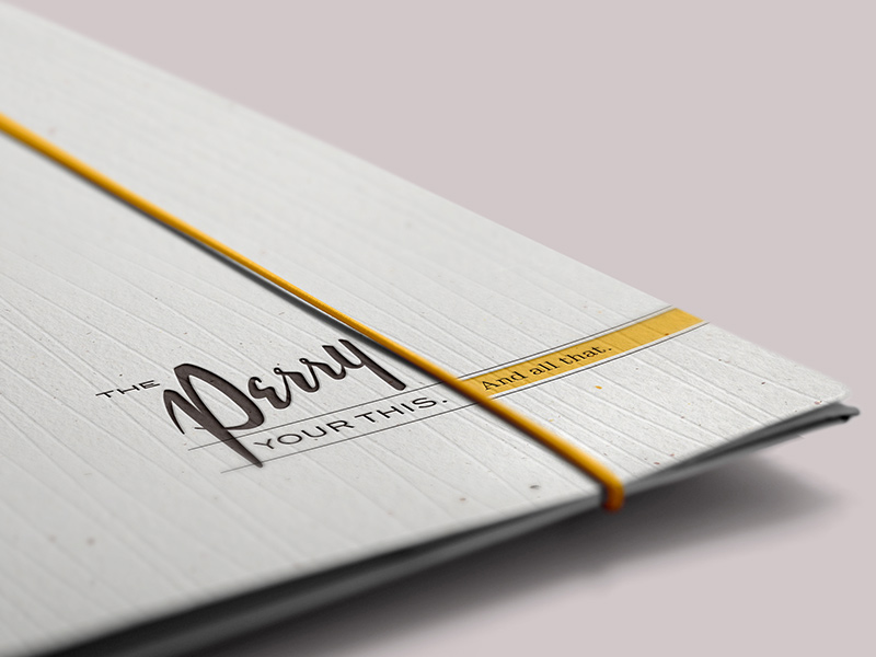
Brochure cover.
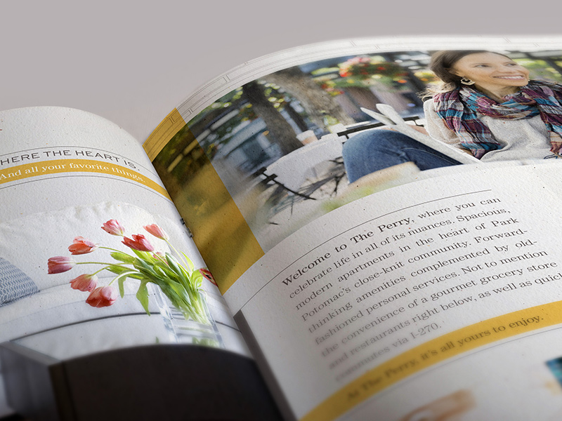
Brochure interior spread.
Brochure interior spread.
Brochure interior.
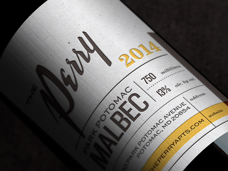
Branded wine bottle move-in gift.
Branded wine bottle move-in gift label detail.
Construction banner.
What do you think?
atomicvibe would love to know your thoughts on this project!
