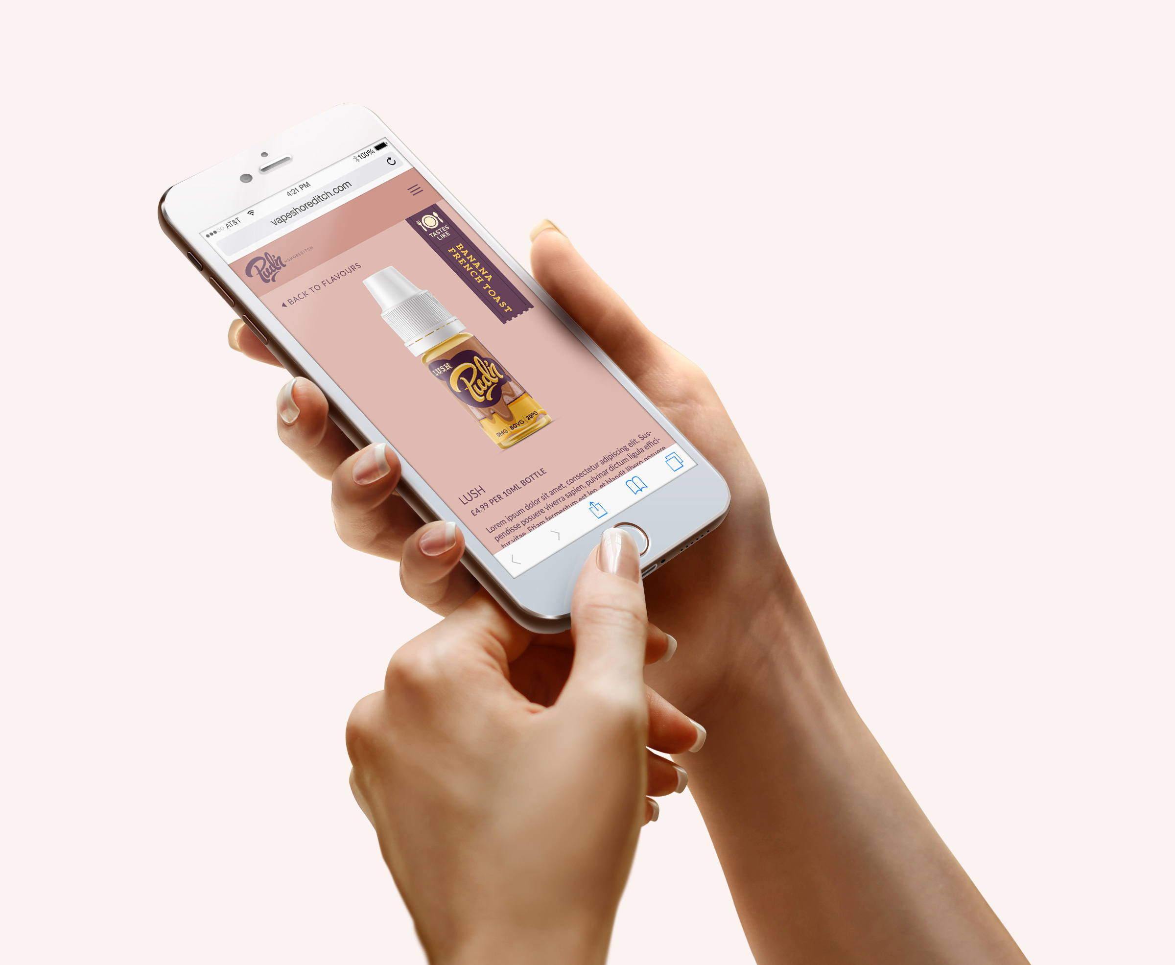
Pud’n by Shoreditch
E-liquid branding & packaging
Overview
Background
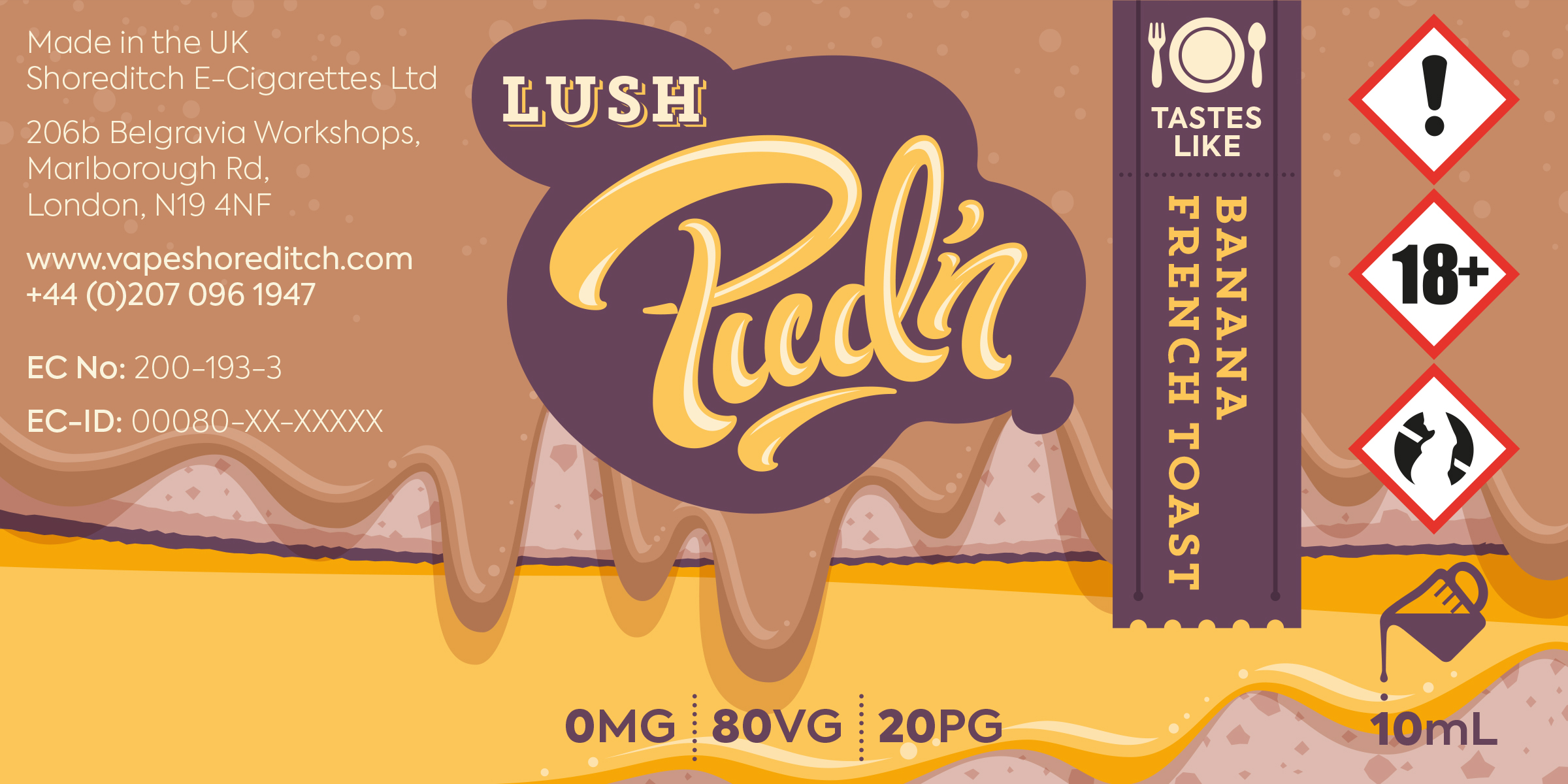
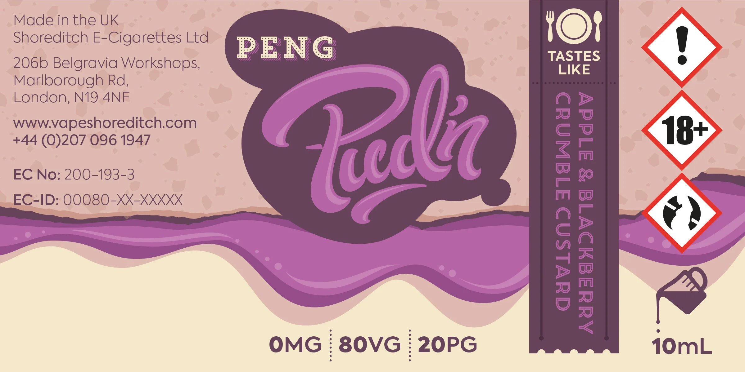
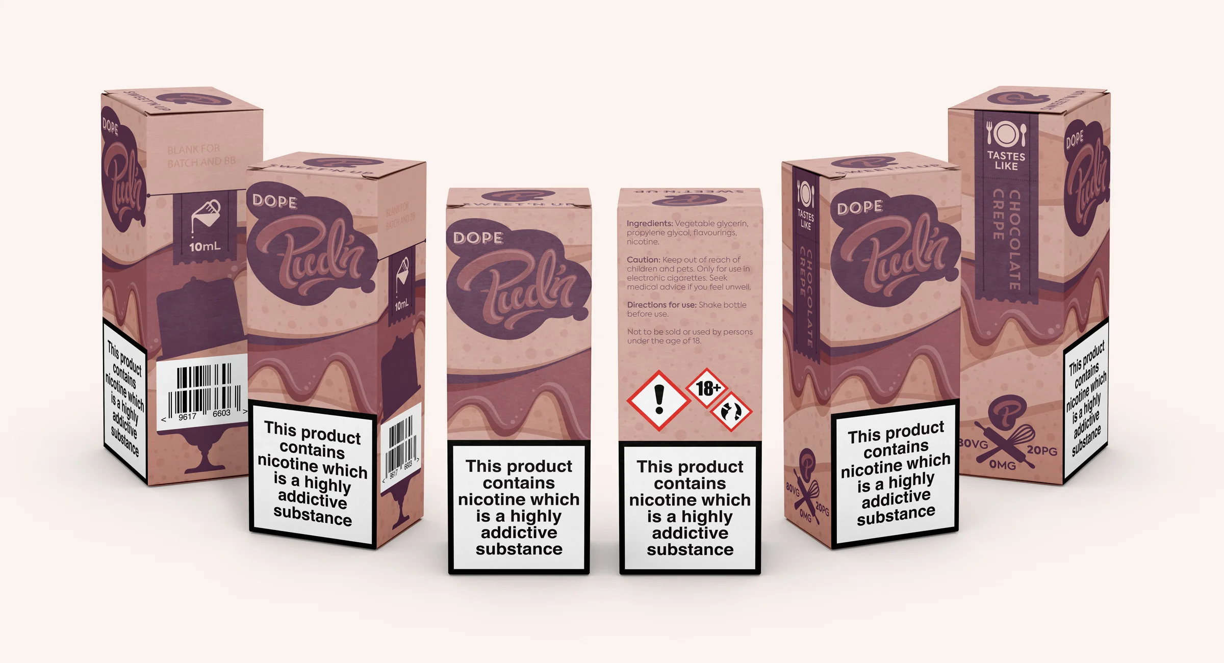
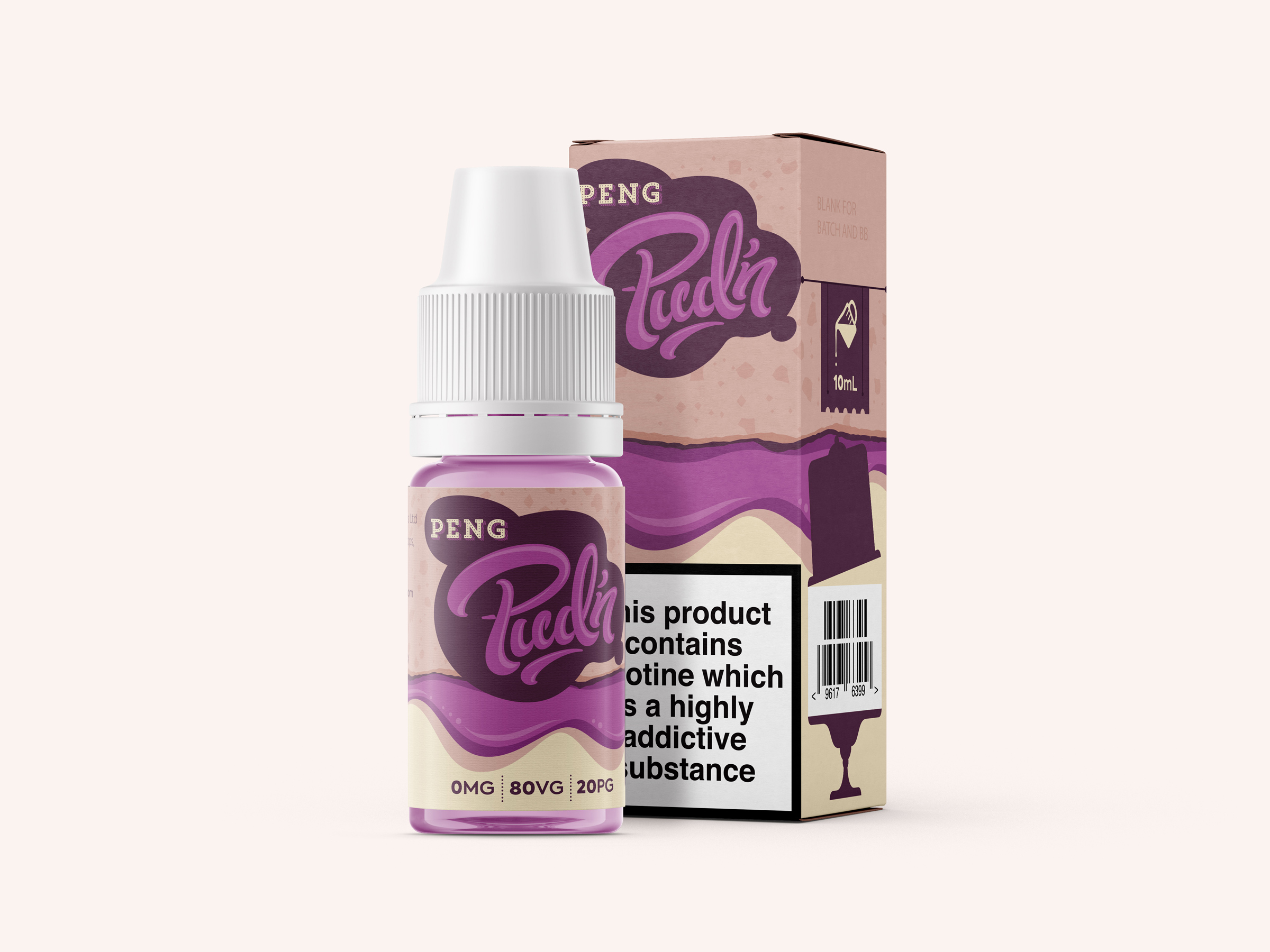
Pud'n is a new range of dessert-inspired flavors of e-liquid, produced by Shoreditch, an innovative, London-based e-cigarette startup. While the Shoreditch branding has a sleek, modern, and minimal design aesthetic, the objective for Pud'n was to distance it quite a bit from Shoreditch parent brand by establishing its own unique visual identity.
Shoreditch was interested in pursuing an illustrated visual language for Pud'n, but recent regulations prohibiting the depiction of food on e-cigarette packaging presented a major challenge.
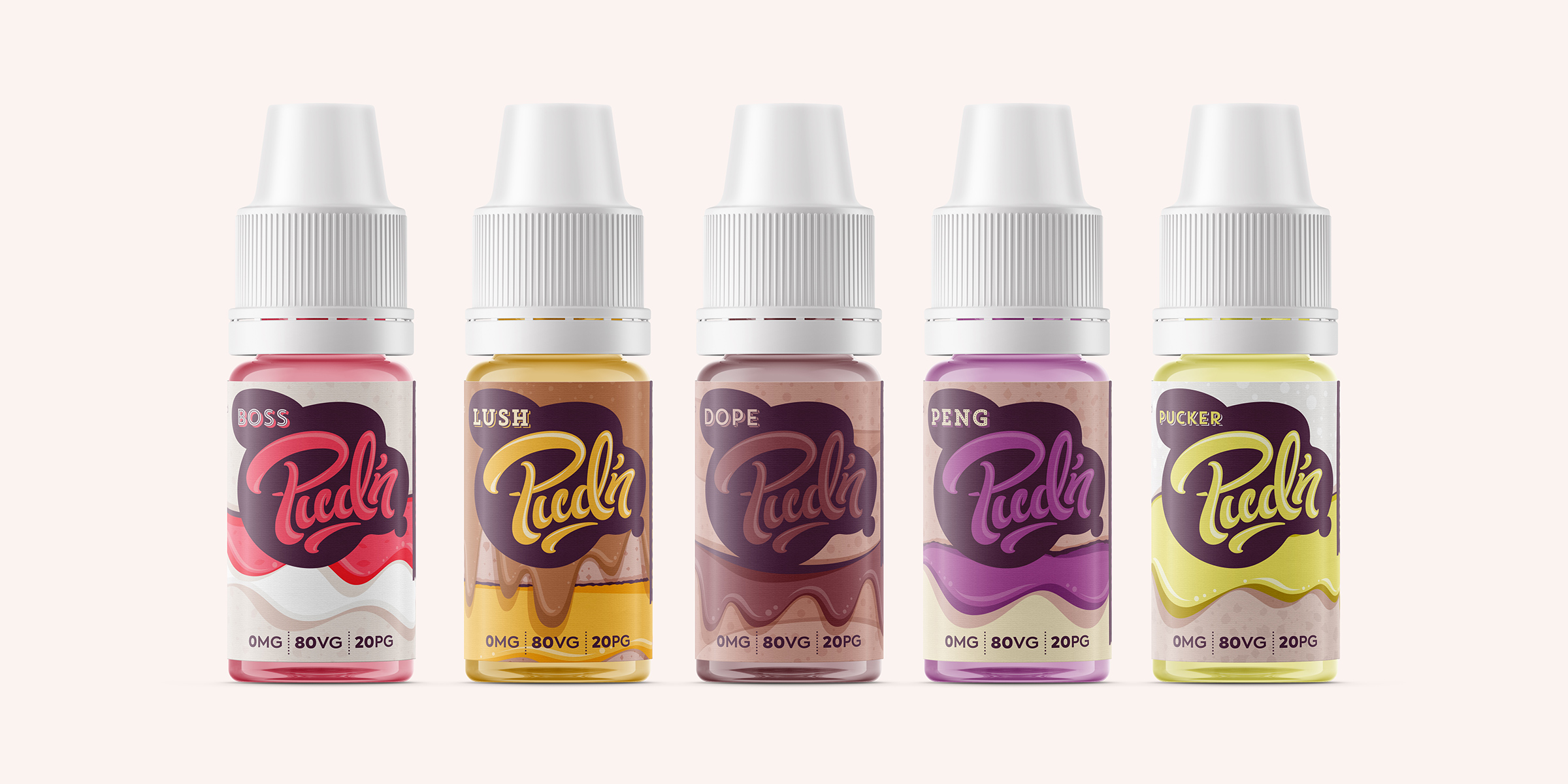
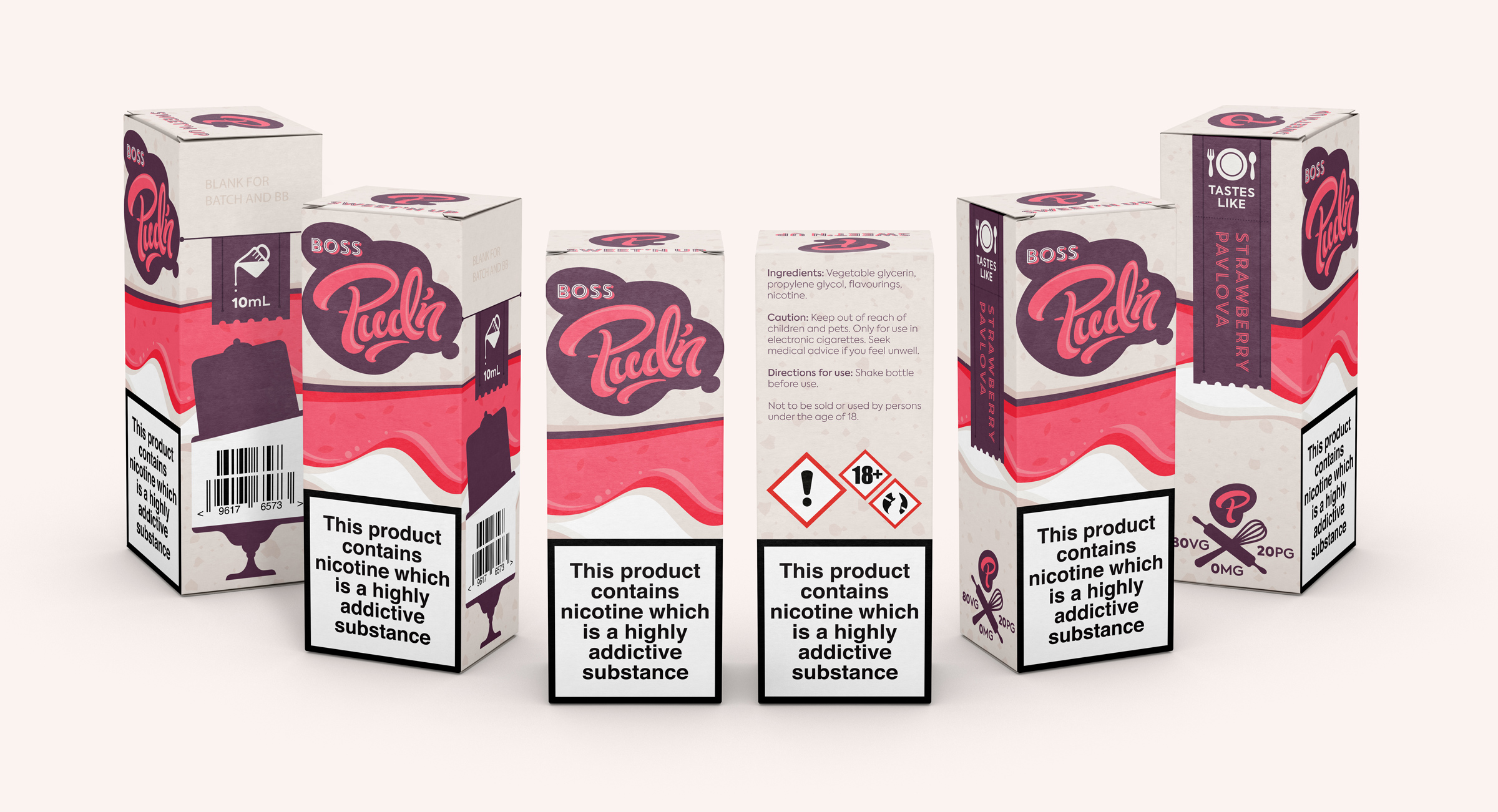
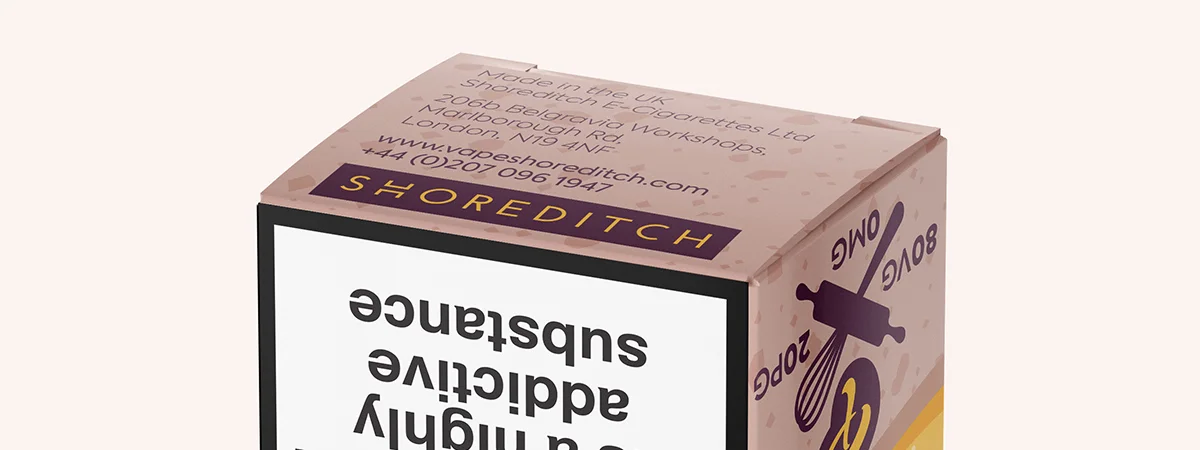
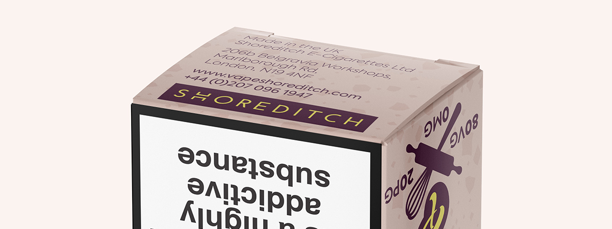
Pud'n will launch with five flavors, so in addition to branding and visual identity, packaging design for bottles and unit packs was also a requirement.
Tone
Whimsical, fun, and fresh, with a touch of attitude. Bold, and vibrant, and full of movement.
Logo development process
Music: “Still Night” by Pretty Lights
© Pretty Lighs, 2010. All rights reserved.
Copyright Disclaimer:
Under Section 107 of the Copyright Act 1976, allowance is made for "fair use" for purposes such as criticism, comment, news reporting, teaching, scholarship, and research.
Fair use is a use permitted by copyright statute that might otherwise be infringing. Non-profit, educational or personal use tips the balance in favor of fair use.
Sketches
Logo
Applications
What do you think?
atomicvibe would love to know your thoughts on this project!


